top of page
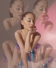
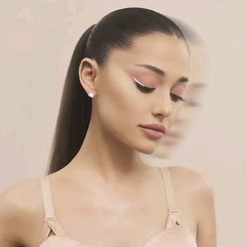
MY VISION VISUALISED
;; r.e.m. \ ar-ee-em \ noun
the sleep phase where your most creative, vivid dreams occur. ;;
To start, I like the concept. Creative and vivid are two adjectives apt for makeup, be it for looks or to sell. However, as full of potential and wonder the concept sounds, everything else that follows falls flat (my opinion.)
So, from here on out, welcome to my sleep phase.

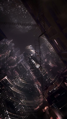
Stage 0.0:
Sleep stages.
-
Stage 1 (N1) is the lightest stage of sleep and occurs as a person first falls asleep.
-
Stage 2 (N2) is where the body starts to relax more deeply. Body temperature drops, muscles relax, and heart and breathing rate slow.
-
Stage 3 (N3 or deep sleep) is the deepest and more restorative sleep, allowing the body to recover and grow.
-
Stage 4 (REM Sleep) is where most dreaming occurs, brain activity increases, and the body becomes temporarily paralyzed.
(Wholly taken from sleepfoundation.org)
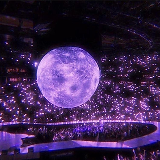
/Lost Potential/
I think r.e.m. beauty shouldn't have launched with space-age aesthetic, rather they should've slowly built it up, following the sleep stages.

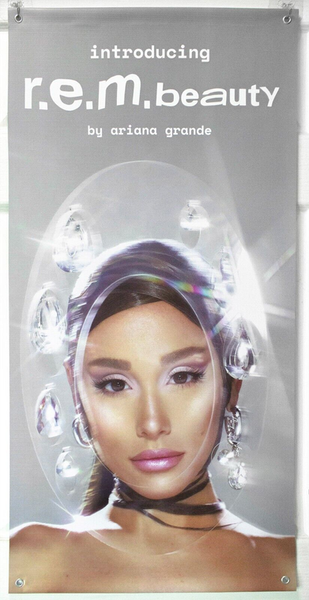
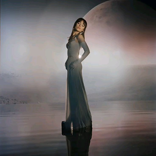
These posters for r.e.m. beauty are only communicating two things. One, r.e.m. beauty by Ariana Grande is launching/has launched. Two, it's inspired by space-age.
And thus, it's already restrictive.
Space-age? Space aesthetics. And only space aesthetics.
(Wholly taken from adorno.design)


The origins of space age design can be traced back to the exciting era of space exploration in the 1950s and 1960s. Space age design sought to embody the optimism and sense of possibility that space exploration brought to the forefront. Inspired by space capsules, spacecraft, and the cosmic environment, designers embraced innovative materials and unconventional forms.
(Wholly taken from antoine-store)
Space-age aesthetic is very specific. It was born during a time where people were captivated by space and are in full wonderment of what else might be out there, floating alongside us. Though this sentiment ties in well with r.e.m.'s creative and vivid dreams, the aesthetic itself does not allow room for more interpretation.
The space-age aesthetic should just be one of r.e.m.'s aesthetic, not the whole aesthetic.
Stage 0.5:
It's not going to be called "Chapter".
Why oh why is it "Chapter" instead of "Stage"?
(No, really, why??)
"Stage" "Phase" "Chapter" These words are all synonyms, used to differentiate parts of a process. So technically, these words can be used interchangeably, but as part of a brand identity, not quite.
Words have associations. "Chapter" is immediately associated with books or lessons, so out of the three, this word should've never made it on the vision board.
"Phase" could be ideal, since "sleep phase" is already used in brand message, but it's just shy of perfection.
"Stage" is most fitting, because it's Ariana Grande's brand, which means, not only is it an actual word /noun/ used during the process of (space flight), it is a word /verb/ used for performances and shows.

(A fun interlude ;))
Now that the technicalities are out of the way, let's start with my r.e.m. beauty.
Stage 01:
/The Lightest Stage/
The first launch for a makeup brand. The first step to begin a night's rest and experience new dreams.
The first stage is a myriad.


(ignore the man)
A very literal understanding of r.e.m. and entering a dreamscape, yes, but in my experience, abstract works work better when a basic understanding is established.
It's simple, yet intriguing. Why is there a house in the middle of nowhere? Why is there a balcony with no room? And the random structures in the middle of the beach?
Why is behind the door? Why is there a product suspending in the air? What does it do?
And as for the name myriad: myriad of choices, myriad of styles, myriad of combinations.
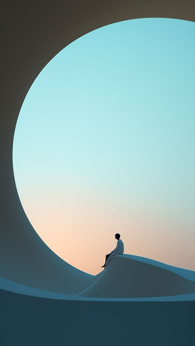
(ignore the man once more)
(imagine a product here, suspending in midair)
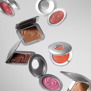
For product launches in Stage 01:
It's the beginning of sleep, the anchor for the dreams, so the products should reflect as such.
- Eyebrow pencil
- Eyeliner
- Lipstick
Basically the products needed to frame your face. (maybe foundation too?)
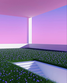
Stage 02:
/Time for Relaxation/
The body falls deeper. It's in between stages.
It's liminal.


(bottom two pictures taken from anotherworldcore on TikTok)
Transitional phase opens up more worlds for introduction, including for space-age, and it allows more room for other concepts, which resonates with r.e.m.'s blending of dreams and creativity.
The aesthetic for each world will be dependent on the products and what storyline to create around it, but just as an example, the transitional phase can be reflective of Ariana Grande's albums and eras.
space-age; bold; playful


(image from anotherworldcore on TikTok)


sci-fi; surreal; enigmatic

dreamy; colourful; imaginative


(image from anotherworldcore on TikTok)
apocalypse; unrestrained; fixed

**
(btw for the fourth concept, there's an advertisement hidden from this incident)
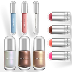
For product launches in Stage 02:
It's transitioning to a "deeper sleep", so products should be built upon products in Stage 01.
- Eyebrow gel
- Eyeshadow
- Lipliner/gloss
- Highlight/Bronzer
- Concealer
Really any products that elevates a makeup look.
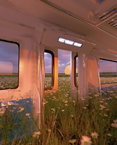
Stage 03:
/Restoring in progress.../
Suspended between time. Floating between spaces.
The mind is unwinding.


As the body falls deeper, the mind relaxes further. So product launches in Stage 03 will take an "unexpected" turn. Instead of continue building off the basics (more liners, more glitter, more shadows), introduce elevated basics. Products that aren't technically necessary, but nice to have.
- Facial mists
- Cooling balms
- Primers
- Lip oils
Stage 03 can be used as a smooth segue for the skincare line. Either way, the third launch should feel like a happy surprise. Keeps customers on their toes and drive more attention to the brand.
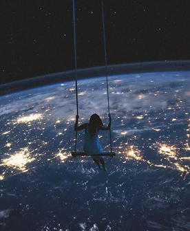
Stage 04:
/Welcome to a new world/
Welcome aboard. Feel free to jump on clouds or swing from star to star.
It's a load of fun and wonder to be astral.


Finally entering the most vivid and creative dreams, bring it to reality with Stage 04 products.
Products for this stage should be the most of the most. Grandeur. Resplendent. Sui generis.
- False lashes
- Plumping lip gloss
- Anything but neutral palettes
This is the crescendo.
Stage 04.1:
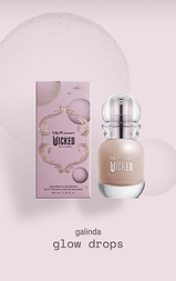
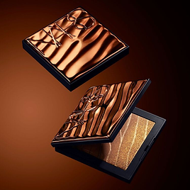
Now that the makeup launches are (almost) up, up and away, it's time for the finishing touches and make sure they are fully prepped. aka, packaging.
(what's happening here?)

The thing about r.e.m.'s current packaging is that it's anything but creative and vivid. It honestly also looks like children's makeup (but not as colourful), which pains me because they can make it fun, I just don't know why they aren't?


(don't these look so much more fun?)
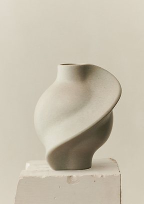
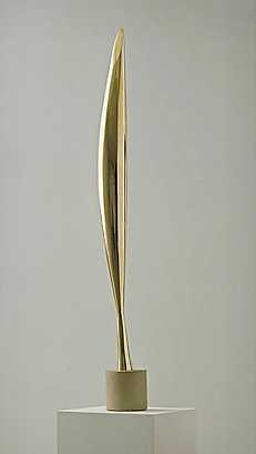
Anyway, my choice for r.e.m. packaging will be born out of my love for functional art, in particular sculptural design.
(I can't draw nor design, but feel free to utilise your imagination based on the below inspirations :))
Lip products:


Pencil/Liners:


Palettes:

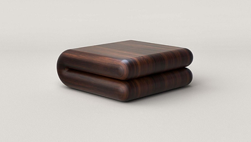
In short, the packaging should resemble art sculpture. Ties in perfectly with the concept of r.e.m. and although taught not to judge a book by its cover, the cover catches attention and subsequently sells, like with packaging.
Good packaging sells, good products sell again.
Stage 05:
/...and welcome back/
If it goes up, it comes down. Not two worlds apart, but
together in harmony.
It's a soulmate thing. It's kindred.
(akin/skin, a/s, as is, and so it is; there's something here I just don't know what is it yet.)

(just needed a visual break here)
As with (most) celebrity makeup brands, r.e.m. is eventually going to develop skincare and body care lines too, seeing they already have (some) skincare products and place emphasis on skincare infused makeup.
The formulations for skincare products are one thing, branding and packaging are another. In keeping with the name r.e.m., the skincare should focus on r.e.m. (deep sleep) being imperative to maintain physical and mental well-being.
So, r.e.m. gives you creative and vivid dreams, while also helping to regulate the brain. And in so, two clear branches, makeup and skincare.
Two stories. Two ideas. Two distinct packaging.
Makeup is art.
Skincare is healing.


Crystal inspired packaging feels like a no-brainer for r.e.m.'s skincare line. Communicates just about everything needed.
- Healing
- Luxurious
- Like a dream/other-wordly


The colours for the skincare line should be neutral/muted. Separating itself from the makeup line, the world for Stage 05 should evoke a sense of wonder. Calmer, more at ease.
r.e.m. beauty (my version):
/in summation.../
Stage 01: Myriad

Stage 02: Liminal

Stage 03: Unwind
Stage 04: Astral

Stage 05: Kindred

Backstage:
/some final thoughts/
r.e.m. beauty is Ariana Grande's line, so at the end of the day, even with an ordinary branding, it's still going to sell...because it's Ariana Grande's.
It's just a shame because Ariana Grande is such an accomplished singer with seven studio albums, all with such different visuals and concepts each era, making r.e.m. beauty a standout should be quite simple. And it's r.e.m., rapid eye movement, the concepts that could be born from the name itself should be limitless, but instead they boxed themselves in with space-age (a very inflexible concept at that), and now the brand isn't cohesive nor outstanding.
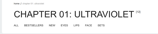
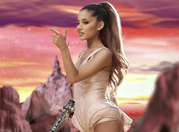
Chapter 01: Ultraviolet
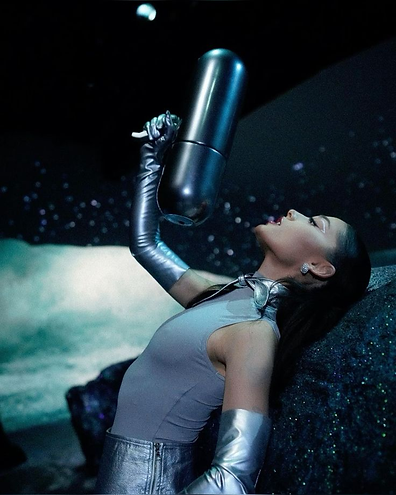


space-age
Chapter 02: Goodnight & go

a dream?
Chapter 03: On Your Collar


Urania? Greek Muse of Astronomy?
Chapter 04: Out of Body

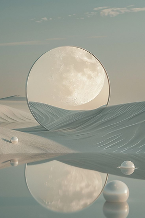
?? at a desert ???
The brand's visual identity is very clearly derived from space age art movement at launch. However, space age aesthetic is not just simply a photo of outer space or the various planets. The aesthetics of space age design were characterised by smooth lines, organic shapes and metallic surfaces (industrialkonzept team, 2023).
r.e.m.'s packaging and Chapter 01's visuals are cohesive with space, but Chapter 02 - 04 are not.
The names for Chapter 01: Ultraviolet and Chapter 04: Out of Body can be related to space age, Chapter 02: Goodnight & Go and Chapter 03: On Your Collar can't.
The good news is however, that since r.e.m.'s brand idea first and foremost is about dreaming, so a rebrand should be relatively simple. And when a rebrand is underway, the first thing to go is the current packaging. I think their current packaging is simultaneously too specific, and yet not specific enough.

It's space age design!!
Or is it?


(Finally) Published on 19/7/25
Disclaimer: Unless stated otherwise, all pictures came from Pinterest.
All ideas reflected on this page came from myself and only myself. Any coincidences to existing concepts, drop me a call and let's create an empire together ;)
bottom of page